
 Credit: Shutterstock photo
Investment Directions submits:
Now is the time to get serious about owning US stocks.
Below are two graphs that can provide insight into this period. Then, we will discuss ways investors can step into this market wisely and confidently.
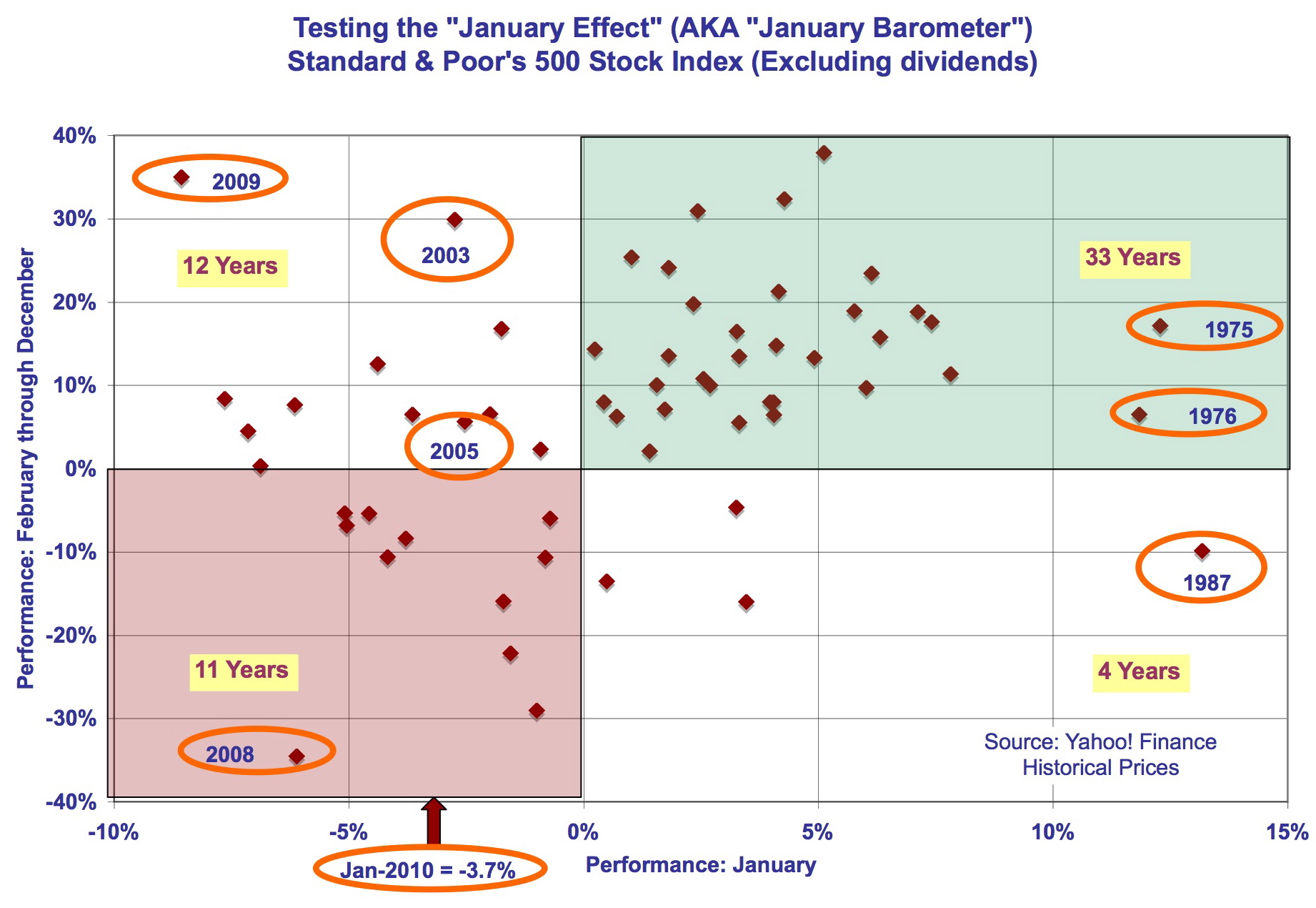
Many now feel that, following the run-up from last March, the stock market is due for a drop (perhaps a large one). Some are talking about the supposed negative "January effect" (AKA "January barometer"). The thought is that January sets the stage for the rest of the year. This year the Standard & Poor's 500 Stock Market Index (S&P 500) declined in January, so there is worry that the rest of the year could follow suit.
The January-tells-all theory has only lightweight rationale - but it appears to work at times. The graph below shows the 60-year history: 1950 to 2009. The January return is on the bottom axis, and the February-December performance is on the vertical. Each dot represents one year. The shaded boxes show where the returns were in the same direction: green for up, red for down. The white boxes hold those that did not match: upper-left = January down, rest of year up; lower-right = January up, rest of year down.
click to enlarge
Note that with January rises (37 years), the "effect" looks pronounced: in 33 years, the rest of year was up, versus only 4 down. However, the 22 years when January was down, it was a 50/50 mix: the rest of the year was up in 12 years and down in 11 years. Circled are the four down Januarys in the last decade - three were incorrect indicators, including last year.
So, what about this year's 3.7% drop? Flip a coin.
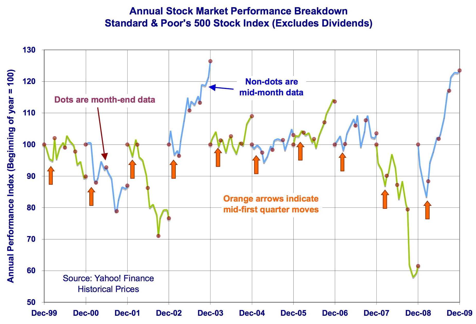
Now, I want to get into another analysis that shows our current quarter is not unusual. This next graph presents a unique performance line for each year. Because I have found that mid-months often present buying/selling opportunities, I prefer not to focus strictly on calendar periods. I have connected the S&P 500's performance from the quarter's beginning to each mid-month to quarter's end. As an example, the first quarter 2009 line runs from the December 31, 2008 close to January 15 to February 15 to March 15 to March 31, 2009.
Now, look at the orange arrows, pointing to each first quarter. Notice how many times the first quarters had roller coaster moves - like this year. The reason for this volatility is that investors are trying to forecast the new year's earnings - with many months to run - as the last of the previous year's earnings reports come in. Thrown in are the buying/selling effects of tax selling and institutional fund flows. These wiggles can give us an advantage at this time of year.
So, enjoy the market's ride as this quarter serves up opportunities.
Disclosure:No positions
See also Sorry Soros, Gold Is Not the Ultimate Asset Bubble on seekingalpha.com
The views and opinions expressed herein are the views and opinions of the author and do not necessarily reflect those of Nasdaq, Inc.
The views and opinions expressed herein are the views and opinions of the author and do not necessarily reflect those of Nasdaq, Inc.

