
Looking for the Perfect Stock Price
We run an exchange that trades more than 1 billion shares each day and lists more than 2,600 companies, so we’re constantly focused on ways to improve trading economics and market quality. As regular readers know, much of our recent research has looked at this.
Today we start with the recent studies showing the drift higher in stock prices since 2008 has been bad for companies in that it harms tradability. This increases cost of capital, leading to reduced wealth of investors and shareholders.
This finding probably won’t surprise traders. Much of our earlier analysis shows how markets have adapted—in unintended ways—to reduce artificially-high trading costs for these stocks. We’ve seen that stocks with prices:
- Too low end up trading more in inverted venues and off exchange, increasing fragmentation.
- Too high end up with odd lots inside their “best quote,” resulting in off exchange trade throughs that cost investors money.
Both made stocks spreads more expensive
We saw in the data, a U-shape spread costs curve across stock price for each market cap in Chart 1 here.
Today we’re going to dig deeper into that data. We start by looking at just large- and mega-cap stocks in Chart 1 below.
Chart 1: Adding some spread and queue dimensions to our U-shaped spread curve
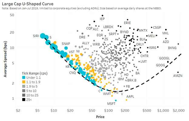
Source: Nasdaq Economic Research
You can see the same U-shape to spreads, but we have added new colors and circle sizes that represent some liquidity metrics:
- Blue circles are “tick constrained.”
- Black circles are stock trading multiple ticks wide.
- Larger circles show relative queue size.
The results highlight how tick-constrained stocks not only see their spread forced wider in basis points (higher up the vertical axis as stock price falls), but how their queue size increases in response (larger circles).
Conversely, the stocks with higher stock prices are increasingly likely to trade multiple ticks wide (black circles are all to the right side). Black circles have more expensive spreads, even though their queue duration shrinks (smaller circles).
Most importantly, the “cheapest spread” for investors occurs for the stocks in the bottom of the U-shape. It just so happens those stocks have average spreads mostly between 1.1 and 1.9 cents wide (shown by the yellow colored zone); almost, but not quite, tick constrained.
Adding an additional dimension: liquidity
Imagine we then turn this chart 90 degrees like picking up the left side of the page and looking at it from the side. If we keep the circle color and sizes the same, and spread on the vertical axis, but add all stocks by liquidity (value traded) to the horizontal axis. The result is shown in Chart 2.
Note that using “liquidity” in dollars-traded automatically adjusts for the different turnover we saw across similar market-cap stocks in our Turnover Snake analysis.
Chart 2: While more liquid stocks have tighter spreads, those that are tick-constrained or too high-priced have more expensive spreads than comparable “right priced” stocks

Source: Nasdaq Economic Research
The “U-shape” is now harder to see as it’s pointing away from us - but imagine the larger circles are “closer” to us, while the smaller circles are “further away.” Either way, the bottom of the U-shape, with its yellow color, is consistent at the bottom of the data clusters across the horizontal (brown) line.
What does that mean?
Effectively, what we see is that for any level of liquidity (vertical slice) the stocks with worse tradability (tick-constrained blue dots or odd-lot-constrained black dots) have unnecessarily higher spreads. That costs investors more to trade, which we recently found reduces the valuation of the company.
We also see that the yellow zone of “cheapest spread” is downward sloping as liquidity increases (brown line and yellow colored tickers).
A formula for a perfect stock price?
In fact, this data seems to show that the market knows there is an optimal tick for any stock (once you know how liquid each stock is). That’s approximated by the brown line in Chart 2.
The problem is that very few stocks actually have a tick that is optimal (shown by the blue and black dots).
One way to fix this is to split (and reverse split) stocks back to their optimal stock price. Here’s how that would work:
- The formula for brown line gives value to the “optimum” spread (or tick) for each level of stock liquidity.
- And we know the U.S. market has a one-cent tick for almost all stocks.
- Plus we see from the yellow circles in Chart 2 that the stocks that are “almost” tick constrained are the ones with the cheapest spreads to trade.
From there it’s easy to reverse engineer the optimal stock price. As the horizontal reference lines in chart 2 show, a stock with sufficient liquidity to deliver a 10 basis point tick would be best with just over a $10 stock price, while the most liquid stocks could trade at a 1 basis point tick, so should target around a $100 stock price. The market tells us that formula is:

How might this work in practice? Consider these two examples based on the data in Chart 2:
- REVERSE SPLIT: SBUX and GE both trade around $1 billion per day, so you see them on the same “vertical” line in the chart. But SBUX has a spread of less than 2 basis points, while GE is trading more than four times wider (thanks to being a tick constrained large blue dot). The data is showing that GE investors would benefit from a reverse split.
- SPLIT: Two of the largest and most liquid stocks it the U.S. market are AAPL and AMZN. However, AAPL has a spread around 1 basis points, while AMZN’s spread costs are around three times higher, despite actually being more liquid. The data shows that AMZN investors would benefit from a split.
What would happen if all stocks traded around their optimal stock price?
Comparing our optimal price to the actual price of the stock even gives us a recommended split ratio. It suggests that stocks like GOOG and AMZN would benefit from a roughly 10:1 split, while GE should consider a 1:10 reverse split.
If we apply this math to all stocks in the U.S. market, we get the data in Chart 3, where the split ratio is on the vertical axis.
Chart 3: Stocks that should split and reverse split by price

Source: Nasdaq Economic Research
We ignore splits between 1:2 and 2:1 (grey zone in this chart), on the basis that those stocks are close to “right priced” already. We also ignore ADRs and stocks priced below $2 per share.
Interestingly, if we got the rest of the U.S. market to “right size” their stock prices we would have:
- 2,180 stocks split (including 367 large-cap stocks)
- 103 stocks reverse split (including 19 large-cap stocks)
Not surprisingly, given the growth in high share prices in the U.S. market, we estimate the market would also trade an additional 3.1 billion shares per day. That’s because splits would add 3.8 billion shares while reverse splits would remove less than 1 billion shares (Chart 4). That highlights the magnitude of this trading problem.
Chart 4: Market-wide impact of getting stocks back to their “perfect” prices

Source: Nasdaq Economic Research
Not only would that remove a lot of the distortions caused by our one-size-fits-all cents-per-share system, data indicates it might also reduce fragmentation and odd lot trading.
Best of all, it’s also a solution that doesn’t require new regulation, and allows corporates to retain control of the way their stock trades.
Go here to sign up for Phil's newsletter to get his latest insights on the markets and the economy.
Other Topics
Stocks
Phil Mackintosh
Nasdaq
Phil Mackintosh is Chief Economist and a Senior Vice President at Nasdaq. His team is responsible for a variety of projects and initiatives in the U.S. and Europe to improve market structure, encourage capital formation and enhance trading efficiency.
Read Phil's Bio